How Color Impacts Video Production: Emotions & Visual Meaning

Color has a remarkable ability to speak to our emotions and ignite our imagination. In the world of video production, understanding the role of color is paramount to creating captivating visuals that resonate with audiences. If you are working with an animation video maker, colour plays a decisive role.
From the vibrant hues of a sunset to the moody tones of film noir, color can evoke emotions, convey meaning, and shape the narrative. In this blog, we will delve into the fascinating realm of color in video production, exploring how it can be used as a powerful tool to captivate viewers and trigger the desired emotions.
Color Psychology and Emotions
Understanding the psychological associations and emotions tied to different colors can greatly enhance your ability to effectively communicate and elicit specific responses from your audience.
Red: Passion, Power, and Excitement
Red is a color that demands attention. It is associated with intense emotions such as passion, love, and desire. In video production services, red can be used to create a sense of urgency, energy, and power. The color red grabs viewers' attention and evokes strong emotions.

The vibrant red triggers feelings of passion, energy, and joy, perfectly aligning with Coca-Cola’s messaging. By consistently using red in its ads, Coca-Cola has created a strong association between its product and positive emotions. The color has become synonymous with the brand itself, making it instantly recognizable and memorable.
Blue: Trust, Calmness, and Stability
Blue is often associated with feelings of trust, calmness, and stability. It has a soothing effect on the viewer and can be used to create a sense of tranquility or convey a trustworthy and reliable atmosphere. Blue is commonly used in corporate videos, medical settings, and scenes depicting serene landscapes or bodies of water.

Yellow: Happiness, Optimism, and Energy
Yellow is the color of sunshine and is closely associated with happiness, optimism, and energy. It has a vibrant and cheerful quality that can instantly uplift the mood of a video. Yellow is used to convey joy, playfulness, and enthusiasm. It can be particularly effective in commercials, children's content, and scenes depicting sunny environments.
McDonald's utilizes a bold combination of yellow and red in its branding and advertising, perfectly aligning with the cheerful and friendly atmosphere the brand aims to create.

Green: Nature, Growth, and Balance
Green is strongly associated with nature, growth, and balance. It represents harmony and tranquility, making it an ideal color for scenes in natural surroundings or those focused on sustainability and environmental themes. Green can evoke feelings of freshness, renewal, and vitality, making it a popular choice for health and wellness content as well.

Purple: Royalty, Creativity, and Mystery
Purple has long been associated with royalty, luxury, and opulence. It also carries connotations of creativity and mystery. Purple can add an air of elegance and sophistication to a video, making it suitable for fashion, beauty, and artistic productions. Additionally, purple can be used to create an aura of intrigue and suspense in scenes with mysterious or supernatural elements.

Black and White: Symbolic and Timeless
While black and white are technically not colors, they hold significant symbolic value in video production. Black represents power, sophistication, and mystery. It can rouse a clean and minimalist aesthetic.
The use of black and white adds a timeless and classic feel to the visuals, emphasizing Nike's long-standing reputation as a leader in athletic performance. This color scheme helps Nike's ads resonate with athletes and consumers who associate the brand with excellence, motivation, and high-performance standards.

Using Color to Establish Atmosphere and Setting
Vibrant and Energetic Mood:
Bold and vibrant colors, such as vivid yellows, oranges, and bright blues, can infuse a video with energy and excitement. These colors are ideal for conveying a lively atmosphere, dynamic action sequences, or upbeat content.
Calm and Peaceful Ambiance:
Soft, muted, and cool colors, such as pastels, light blues, and gentle greens, can establish a serene and peaceful ambiance in your videos. These colors are often associated with tranquility and relaxation, making them suitable for depicting serene natural landscapes, meditation or mindfulness content, or scenes requiring a sense of calmness and serenity.
Darkness, Mystery, or Suspense:
Dark and deep colors, like rich purples, deep blues, or shades of black, can create an atmosphere of mystery, suspense, or even danger. These colors are often used in thriller or suspense genres to heighten tension and intrigue. They can also add depth and intensity to scenes with mysterious or dramatic elements.
Time or Location:
Colors can be used strategically to indicate a specific time or location. For example, sepia-toned or desaturated colors can evoke a vintage or nostalgic feel, perfect for period pieces or flashbacks. Similarly, warm earth tones can suggest a rustic or natural setting, while cool grays and blues can create a futuristic or urban environment. By carefully selecting colors, you can transport your viewers to a specific time or place and enhance the overall storytelling experience.
Tips from the Experts
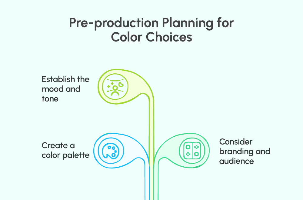
Pre-production Planning for Color Choices

- Establish the mood and tone: Determine the emotions and atmosphere you want to evoke in your video and select colors that align with those intentions.
- Create a color palette: Develop a cohesive color palette that reflects your desired aesthetic and conveys the intended message. Consider the relationships between colors and how they complement or contrast each other.
- Consider branding and audience: Take into account your brand identity and target audience preferences when choosing colors. Ensure that your color choices align with your brand guidelines and resonate with your target demographic.
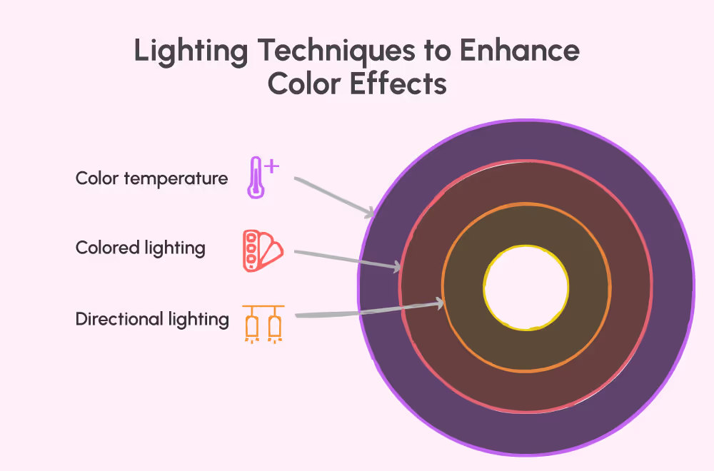
Lighting Techniques to Enhance Color Effects

- Color temperature: Adjust the color temperature of your lighting to match the desired mood. Warmer temperatures (e.g., yellow/orange) can create a cozy or nostalgic atmosphere, while cooler temperatures (e.g., blue) can convey a sense of calmness or suspense.
- Colored lighting: Experiment with colored gels or filters to add specific hues to your lighting. This technique can enhance the overall color scheme and create a more immersive visual experience.
- Directional lighting: Use lighting angles and intensities to emphasize certain colors or create shadows and highlights that enhance the mood and depth of the scene.
Read our blog to understand more about lighting techniques used by a video production house.
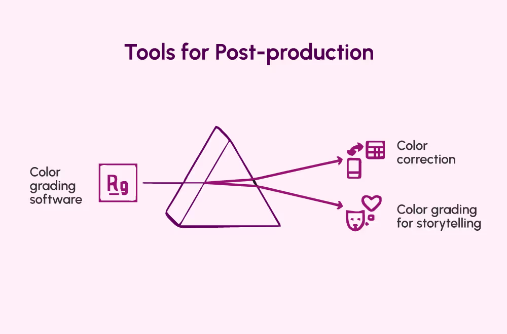
Tools for Post-production

- Color grading software: Explore professional software tools like Adobe Premiere Pro, DaVinci Resolve, or Final Cut Pro X, which offer a range of color grading capabilities to enhance and manipulate colors in your footage.
- Color correction: Use color correction techniques to achieve consistent and accurate colors across different shots. Adjust the exposure, saturation, and white balance to achieve the desired look.
- Color grading for storytelling: Leverage color grading techniques to enhance the narrative and evoke specific emotions. Consider using different color grading styles or looks to create visual motifs or emphasize particular themes.
Learn more about Color Grading tips and techniques, in our next blog, What is Color Grading? A Guide to Stylizing Your Corporate Videos.
Conclusion
Color is a powerful tool in video production, capable of evoking emotions, conveying meaning, and immersing viewers in captivating visual experiences. By understanding color psychology, considering cultural context, and employing practical techniques, you can effectively leverage color to enhance your storytelling and engage your audience on a deeper level.
Ready to elevate your video production and shape sleek corporate branding campaigns with the power of color? Schedule a call with us today and let us guide you through understanding colors.
Fun Fact: According to a study by HubSpot, using color in marketing materials can increase brand recognition by up to 80%.
So, don't miss out on the opportunity to make your videos more memorable and impactful through the strategic use of color.

